Analysis and visualization
Results can be analyzed using any programming language. We recommend to use Python or R. Python libraries such as pandas, numpy and matplotlib and R libraries such as tidyverse and ggplot make it very easy to analyze and process the results.
To execute a Python script, make sure you have Python installed. To check your python version:
python3 --versionIf you do not have Python 3, you can donwload it from Python.org.
To execute a R script, make sure you have R installed. To check your python version:
R --versionIf you do not have R, you can donwload it from R-project.org.
Example#
To run the R script, execute the following command on the shell terminal:
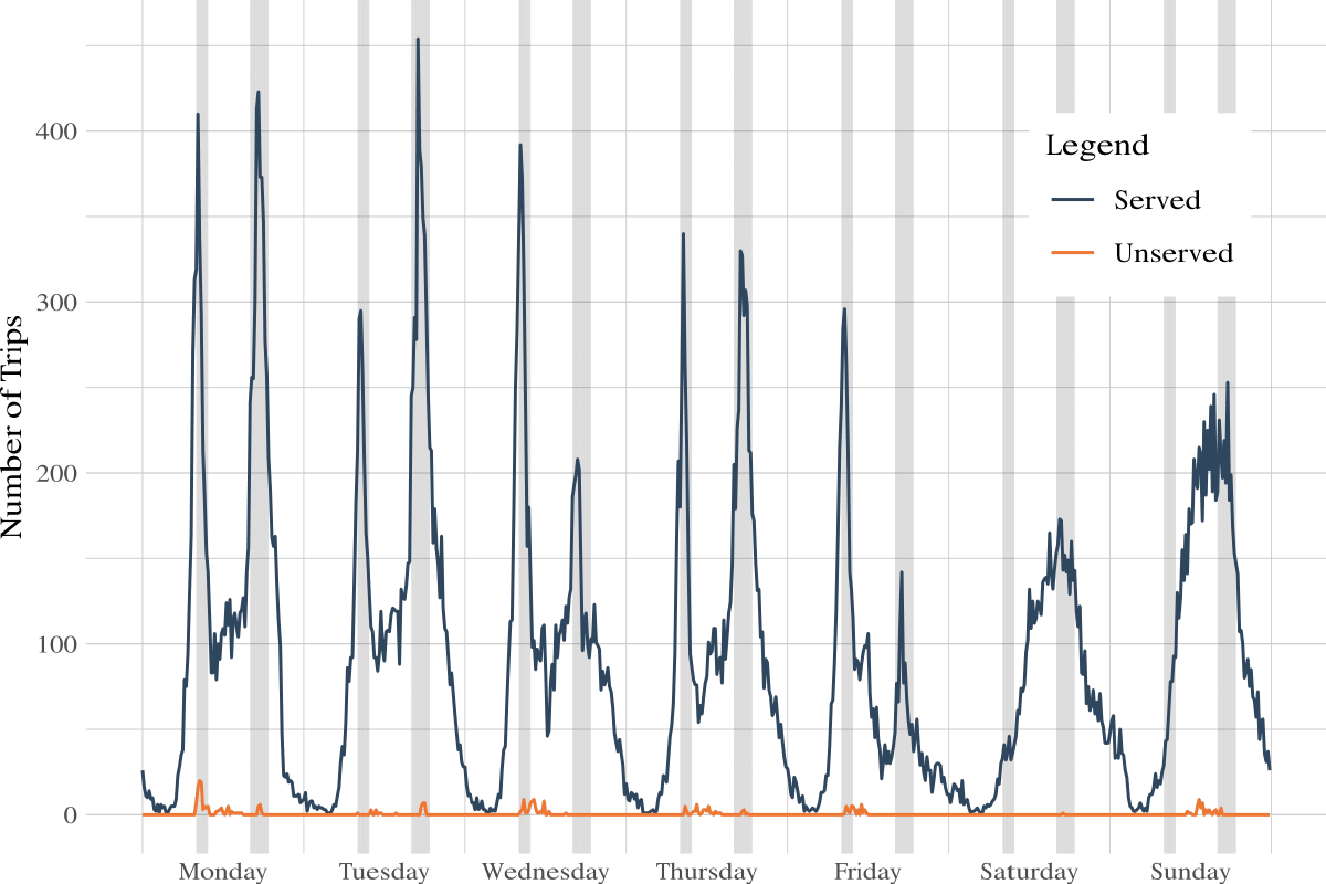
R viz_example.RThe viz_example.R is an example script that creates a visualization of the number of trips served vs unserved.
To create this visualization, first we need to indicate the path to the directory with the simulation results. This path can be changed to yield different visualizations.
The results are stored in the results folder. The subfolder with the results of an specific simulation will have the date and time of the moment when it was launched as a name in %Y-%m-%d_%H-%M-%S format.
We can import the config.json, the user_trips.csv and the bike_trips.csv to R:
path <- "../results/2021-04-20_23-35-47/"
config <- jsonlite::fromJSON(file.path(path, "config.json"))user_trips <- data.table::fread(file.path(path, "user_trips.csv"), na.strings = "None")bike_trips <- data.table::fread(file.path(path, "bike_trips.csv"), na.strings = "None")Then, we can process the user trips dataframe, and calculate the number of trips, served and unserved in each 15 minute interval.
frequency <- 15*60 #minutes# peak times from 7:50 to 9:30 and 15:50 to 18:30peak_times <- c(seq(7*60+50, 9*60+30), seq(15*60+50, 18*60+30)) user_trips %>% dplyr::mutate(interval = floor(time_departure / frequency)) %>% dplyr::group_by(interval) %>% dplyr::summarize( num_trips = dplyr::n(), served_trips = sum(!is.na(time_ride)), unserved_trips = sum(is.na(time_ride)) ) %>% tidyr::pivot_longer(cols = c(num_trips, served_trips, unserved_trips)) %>% dplyr::mutate( ts = interval * frequency, date = as.POSIXct(ts, origin = origin, tz = "GMT"), time = lubridate::hour(date)*60 + lubridate::minute(date), peak = time %in% peak_times ) %>% ggplot2::ggplot()+ ggplot2::geom_line(ggplot2::aes(x=date, y=value, color=name))+ ggplot2::geom_rect(data = . %>% dplyr::filter(peak), ggplot2::aes(xmin=date, xmax=date+frequency, ymin=-Inf, ymax=Inf), alpha=0.1)+ ggplot2::scale_x_datetime(date_labels = "%d-%m-%Y", date_breaks = "1 day", date_minor_breaks = "1 hour")+ ggplot2::ggtitle("Trips served / unserved")+ ggplot2::theme_bw()You can find more of these R scripts on the analysis directory in the source code repository on Github.